• About Me
    • Power BI with Me Blog

Power BI with Me

  • The ‘Why’ of It All Edition

    February 11th, 2026

    Why “Why?” is the most important question

    When people hear the word why, they often brace themselves.

    It can feel combative.
    Invasive.
    Judgmental.

    As if the person asking is about to clutch their pearls and say, “I’m sorry… you want to do what with the data?”

    But in data, analytics, and AI—especially when designing solutions in Microsoft Fabric and Power BI—“why” is not an attack. It’s the most important tool we have.

    The Real Job of a Data Platform

    There’s a common misconception that the purpose of a reporting platform is to answer questions like:

    • What happened?
    • How many?
    • What’s the total?

    Those answers are necessary—but they’re not the point.

    The real purpose of your data and reporting platform is to help people understand, decide, and act. To support decisions you know you need to make today—and the ones you don’t know you’ll need tomorrow.

    You can’t design for that without asking why.

    “Can I Export This to Excel?”

    Let’s talk about the most famous Power BI question of all time:

    “Can I export this to Excel?”

    Of course you can.
    Power BI is a Microsoft tool—Excel is practically a sibling.

    But here’s the thing: when I ask why, I’m not offended. I’m not disappointed. I’m not silently judging your life choices.

    I’m curious.

    Because there is always a reason.

    The Many Reasons Behind “Excel”

    When someone wants to export to Excel, it could be because:

    • They’re simply more comfortable there
    • Their team is resistant to change
    • They need to merge this data with additional data
    • They want to create a visualization that doesn’t exist in the report
    • They need to print it
    • They’ve “always done it that way”
    • They’re asking for… a friend

    Each of these reasons points to a different solution.

    If I don’t ask why, I’m forced to design for the perceived requirement, not the actual need.

    And that’s how we end up with technically correct solutions that still fail to deliver value.

    Designing for the Questions You Don’t Know Yet

    One of the most powerful outcomes of asking “why” is that it pushes us beyond today’s questions.

    Not just:

    • The questions you know you need to answer
    • The questions you think you might need

    But the questions you don’t even know you’ll need to ask yet.

    This is where thoughtful data modeling and platform design quietly do the heavy lifting.

    A Brief (non-why ask why) Side Quest: Star Schema and Intentional Design

    The need/ask of tomorrow is one of the many reasons I’m such a strong advocate for dimensional modeling and star schema.

    Not because they’re old.
    Not because they’re academic.

    But because they force intentionality.

    When you take the time to define:

    • Facts (what happened, at what grain, and why it matters)
    • Dimensions (how the business actually wants to slice, filter, and reason about those facts)

    You create a structure that is:

    • Understandable to humans
    • Predictable for analytics
    • Scalable over time

    In Fabric terms, this often shows up as well‑intentioned Gold views—not just “cleaned up tables,” but views that are purpose-built to serve a semantic model designed around a star schema.

    Those Gold views aren’t for everyone to query directly.
    They exist to serve the model, and the model exists to serve the user.

    That chain of intent—from Bronze to Silver to Gold to semantic model—is much harder to achieve if you never stop to ask why the data is being used in the first place.

    And when you do ask why, you give yourself the freedom to add new facts, new dimensions, and new business questions later—without rebuilding everything from scratch.

    Why Asking “Why” Reduces Waste

    Let’s be honest: there’s a lot of waste in analytics.

    • Models that never quite get used
    • Reports that look great but don’t drive action
    • Dashboards that answer questions no one is asking
    • People using a visualization or BI tool only to export the data and do their “real” analysis somewhere else

    Asking why early—and often—helps surface these issues before they’re locked into the solution.

    Why build a model and report that still doesn’t provide what is actually needed?

    Why optimize visuals when the real problem is confidence, trust, or usability?

    Why This Matters Even More in the Age of AI

    As we move further into AI-enabled analytics, semantic models, and natural language querying, the importance of why increases—not decreases.

    AI is very good at:

    • Aggregating data
    • Finding patterns
    • Answering well-formed questions against a well-defined semantic model

    What it cannot do on its own is:

    • Understand organizational context
    • Infer business intent
    • Distinguish between an interesting question and a meaningful one
    • Know which metrics actually drive decisions versus which are just “nice to know”

    AI amplifies whatever structure and assumptions you give it.

    If your model reflects unclear intent, unchallenged assumptions, or legacy “we’ve always done it this way” logic, AI will happily scale that confusion—faster and more confidently than ever before.

    Asking why is how we:

    • Clarify intent
    • Define meaning
    • Encode business logic on purpose into the semantic layer

    That’s what makes AI useful instead of noisy.

    Final Thought: “Why” Is an Act of Respect

    When I ask why, I’m not questioning your intelligence or your intent.

    I’m saying:

    • Your time matters
    • Your decisions matter
    • Your outcomes matter

    And if we take the time to understand the real need—not just the request—we can build solutions that last longer, scale further, and actually deliver value.

    So yes.
    You can export it to Excel. Yes, you can insert other request here.

    But let’s talk about why first.
  • Do You Want to Build a Model? Sing Along Edition

    November 7th, 2025

    After a very long day yesterday I was thinking about thigs I wanted to do with my daughter over Thanksgiving break and it reminded me of the year that Frozen came out and I took her to the movies for the very first time the day before Thanksgiving. What does this have to do with Microsoft Fabric and Power BI, you might ask? Well… when you have AuDHD a random memory can lead to an equally random need to go down the rabbit hole on some other seemingly un-related side-quest.

    I invite you all to sing along with me – I bet you know the tune…

    Do you want to build a model?

    A semantic one that slays?

    It starts with bronze, then silver shines,

    Gold refines—

    Dimensional all the way!

    We used to wrangle flat files,

    Now we’ve got Lakehouse dreams—

    With medallions stacked and clean!

    Do you want to build a model?

    Let’s optimize that schema throttle—

    Come on, let’s stream!

    (Click… click… click…)

    Do you want to build a model?

    With star joins that perform?

    We’ll follow Microsoft’s best advice—

    Kimball’s spice—

    And keep that logic warm!

    I think some facts need bridging—

    Slowly changing types—

    Let’s version Type 2 right!

    (Oh, surrogate keys…)

    🎶 *Bridge:*

    Fundamentals aren’t optional—

    No duct-tape DAX allowed!

    You need clean grain, conformed dimensions,

    Not just vibes—

    Or clouds that make you proud!

    We build with purpose, not just pipelines—

    Each table tells a tale—

    Of insights we unveil…

    Do you want to build a model?

    Let’s go from raw to gold—

    And make it bold!

  • The Star Schema Re-Visited Edition

    September 30th, 2025

    By: Audrey Gerred

    Why I’m a Broken Record About Star Schema in Power BI

    The Repetition Is Intentional

    I talk about star schema again and again because it’s foundational. It’s not just a best practice — it’s the difference between scalable, performant, governable models and ones that become brittle, slow, and hard to trust. Power BI may not require it, but that doesn’t mean it’s optional.


    Why Star Schema Is So Important

    • Performance: Power BI’s VertiPaq engine uses columnar storage, which means data is stored and compressed by columns rather than rows. This allows for highly efficient scanning, filtering, and aggregation — especially when fact tables are narrow and well-structured. Star schema supports this by keeping fact tables slim and focused, while dimension tables tend to be much wider, which maximizes compression and speeds up query execution.
    • Simplicity: Star schema simplifies the model by clearly separating facts from dimensions. But simplicity doesn’t mean fewer tables. If your model represents ten distinct business entities, it’s not simpler to put them into one ‘dimension’ table — it’s confusing.
    • Semantic Clarity: Dimensions in a star schema represent real-world business concepts/entities (think customer information, product information, associate information, etc.). This makes it easier for users to understand the model, write DAX, and build reports. It also improves discoverability and trust — users can see what each table represents without guessing. As Mr. Kimball taught us, ‘the data warehouse is only as good as the dimension attributes’. Each entity (e.g., customer, product, profit center) deserves its own dimension to preserve semantic clarity and avoid tangled logic. For example, we shouldn’t find the name of a product that was bought in the same dimension table as the name of who it was sold to and the name of the sales-person that gets commission – these are three distinct business entities.
    • Copilot & AI-readiness: Tools like Copilot rely on semantic structure to interpret natural language queries. A well-formed star schema gives Copilot the context it needs to generate accurate measures, filters, and insights. Without it, AI features become less reliable and harder to govern.

    Why You Shouldn’t Ignore It — Even If Power BI Lets You

    Power BI is flexible — but that flexibility can be dangerous. You can build snowflake schemas, flat tables, or spaghetti joins. But here’s what you risk:

    • Slow performance due to inefficient joins and poor compression.
    • Confusing relationships that make DAX harder to write and debug.
    • Poor AI experiences — Copilot struggles with ambiguous or overly complex models.
    • Certification risk — Models that don’t follow star schema are harder to endorse confidently.
    • Semantic ambiguity — Mixing different business entities (e.g., customer name and profit center) into a single dimension table creates confusion. These entities often belong to different domains, have different grain, and serve different analytical purposes. When they’re lumped together, it becomes unclear what the table represents, which leads to modeling errors, misleading visuals, and broken trust.
    • Storage inefficiency — Star schema supports columnar compression, which is most effective when columns contain repetitive, low-cardinality values. When models deviate from star schema — for example, by embedding dimension attributes in fact tables or creating wide, flat structures — compression suffers. This leads to larger memory footprints, slower refreshes, and degraded performance.

    Is It Still a Star Schema If Only Part of Model Is Set Up With Star Schema?

    Not really. A partial star schema is like a half-built bridge — it might work for now, but it’s not structurally sound. If some dimensions are snowflaked, if facts are mixed with dimensions, if many business entities are mixed in one dimension table or if relationships are ambiguous, you lose the benefits of clarity, performance, and semantic alignment.


    Should a Model Be Certified If It Doesn’t Follow Star Schema?

    This is where governance comes in. A certified model should meet a minimum standard of:

    • Semantic clarity
    • Performance
    • Governability
    • AI-readiness

    If a model doesn’t follow star schema, it should be reviewed carefully. Exceptions might exist, but they should be rare and well-documented.


    Should Copilot Be Used on Models That Don’t Follow Star Schema?

    Technically, it can be used — but practically, it’s risky. Copilot relies on semantic structure to interpret user queries. Without a star schema:

    • It may misinterpret relationships.
    • It may suggest incorrect measures or filters.
    • It may frustrate users with inconsistent results.

    If you want Copilot to shine, give it a model that’s built to be understood.


    Final Thought: Star Schema Is Not Just an Option — It’s a Mindset

    Being a broken record about star schema means you’re advocating for clarity, performance, and trust. It’s not dogma — it’s discipline. And in a world of AI-powered analytics, that discipline matters more than ever.

  • The Medallion Architecture Edition

    September 9th, 2025

    By Audrey Gerred

    If you’ve ever tried to wrangle data from multiple sources into something clean, reliable, and ready for reporting, you know it can feel like herding cats. That’s where Medallion Architecture comes in—a layered approach to organizing data in a lakehouse that makes the whole process more manageable, scalable, and trustworthy.

    Let’s break it down.

    Bronze Layer: The Raw Zone

    Think of the Bronze layer as your data “junk drawer.” It’s where all the raw, unfiltered data lands—straight from source systems like APIs, logs, files or databases. In Microsoft Fabric, this might be a lakehouse storing files in formats like JSON, CSV, or Parquet or it could be a warehouse. You’re not trying to clean anything here; you just want to capture it all for safekeeping. You never know when you might need that one Allen Wrench from the bookshelf you put together 3 years ago. This layer is great for auditing, reprocessing, or just having a backup of the original data.

    Storing raw data in a queryable structure also gives you a powerful advantage: data consistency checks. As you enrich and transform data in the Silver layer, you can easily compare it back to the raw source to make sure nothing’s falling through the cracks. This makes the Bronze layer not just a landing zone, but a critical part of your data quality strategy.

    Silver Layer: The Clean Zone

    Once the data is in the drawer, it’s time to tidy up. The Silver layer is where you clean, validate, and transform/enrich the raw data. You might remove duplicates, fix missing values, or join datasets together. In Fabric, this often involves using Apache Spark notebooks or Dataflows Gen2 to transform the data and store it in structured Delta tables. This layer is especially useful for data scientists and engineers who need reliable, well-structured data for exploration, modeling, and advanced analytics. It’s clean, consistent, and flexible—perfect for building out deeper insights before the data gets curated for broader consumption.

    Gold Layer: The Business Zone

    Now we’re talking polished, business-ready data. The Gold layer is where you organize and curate your facts and dimensions—the foundational elements that feed into semantic models and reporting tools like Power BI. Unlike the Silver layer, which is more flexible and often used by data scientists for exploration and modeling, the Gold layer is all about standardization and usability.

    In Microsoft Fabric, this layer becomes especially powerful when paired with consumption views. These views are designed with business users in mind—they include business logic, friendly column names, and clear definitions that make the data intuitive and reusable across teams. Instead of every analyst reinventing the wheel, consumption views provide a consistent, trusted foundation for semantic modeling, dashboards, and decision-making.

    So, while the Silver layer is great for deep dives and experimentation, the Gold layer is your polished product—ready to be consumed, reused, and trusted across the organization.

    Why It Works

    Medallion Architecture isn’t just about organizing data—it’s about building trust. Each layer improves data quality and adds value, making it easier for teams to collaborate and scale their analytics. And in Microsoft Fabric, with its unified OneLake and seamless integration with Power BI, implementing this architecture feels natural and efficient. Add consumption views to the mix, and you’ve got a recipe for high-impact, reusable, and business-friendly data.

  • The Can versus Should Edition

    August 19th, 2025

    By: Audrey Gerred

    After almost a decade of working with Power BI and now Microsoft Fabric —earning certifications, community recognition, and the “Super User” rank in the Fabric Community forums — I’ve seen a pattern emerge (#AuDHD #iykyk): the tools are powerful, flexible, and forgiving, but1 that flexibility often tempts users into practices that feel convenient or familiar2 in the moment but sabotage scalability, performance, and clarity in the long run (you know… in production).

    So, let’s talk about the difference between can and should3.

    1. Denormalized Wide Tables: Yes, You Can. No, You Shouldn’t

    Power BI will not stop you from building a single flat table with all your facts and dimensions crammed together. It’ll even render visuals. But ignoring star schema design is like wiring a house without a circuit breaker—works until something overloads. Just wait until you want or need to scale, optimize, or troubleshoot…

    • Why it matters: Star schema supports efficient relationships, better compression4, and clearer semantic modeling.
    • What to do instead: Normalize your data5. Use dimension tables6. Respect granularity7.

    2. One Model Per Report (1:1): Tempting, But Misguided

    Sure, you can build a separate model for each report. Power BI will not even speak up and object. But this leads to duplication, inconsistent logic, and a maintenance nightmare.

    • Why it matters: Centralized models promote reuse, governance, and consistency. Who doesn’t want that?
    • What to do instead: Build reusable semantic models and connect multiple reports to them.

    3. Implicit Measures: Easy Doesn’t Equate to Right

    Power BI lets you drag and drop fields into visuals and auto-aggregates them. That’s implicit measures. But they’re fragile, opaque, and often misleading.

    • Why it matters: Explicit measures are transparent, reusable, and easier to debug.
    • What to do instead: Define your measures in DAX. Name them clearly. Own your logic.

    4. Measures Table: Optional, But Essential

    Technically, you don’t need a dedicated measures table8. But skipping it is like tossing all your spices into one drawer with no labels.

    • Why it matters: A measures table improves discoverability, organization, and user experience.
    • What to do instead: Create a measures table. Use folders if desired. Include descriptions (HINT: Generating descriptions is a great use of Copilot).

    5. Renaming Fields in Power BI: You Can, But It’s the Wrong Layer

    Renaming columns in Power BI is allowed in the sense that it won’t stop you from doing it — but it’s a semantic patch over a structural problem.

    • Why it matters: Renaming at the lakehouse or warehouse level ensures consistency across tools and teams and minimizes repetitive work downstream.
    • What to do instead: Clean and rename upstream in views. Let Power BI reflect the source, not override it.

    6. Direct Query ≠ Live Data

    It is a very common misconception that Direct Query equates to real-time or streaming data. Direct Query feels “live,” but it’s only as fresh as the source.

    • Why it matters: If your source updates once a day, your Direct Query visuals show stale data until the next load.
    • What to do instead: Know your refresh cadence. Use Direct Query when true real-time/streaming is needed.

    7. Direct Query for Everything? Please Don’t.

    Power BI won’t stop you from using Direct Query for every model. But performance will. And then the complaints from users will.

    • Why it matters: Direct Query introduces latency, limits DAX functionality, and depends heavily on source performance9.
    • What to do instead: Define clear guidelines. Use Direct Query only when:
      • Data must be real-time and source supports it
      • Security requires source-level control10
      • Dataset size exceeds import limits11

    Even then, be sure to add manual aggregate tables and/or create hybrid tables whereby part of the table is in archive, part is import, and part is hybrid.

    Final Thought: Tools Don’t Impose Wisdom—You Do

    Power BI and Fabric are generous. They’ll let you build almost anything. But they won’t stop you from building it badly. That’s where experience, governance, and architectural discipline come in.

    So next time you’re tempted to take the shortcut the tool allows, ask yourself: Just because I can… should I?

    1. But, with great power comes great responsibility! In this case, responsible, sustainable, optimized, re-useable, and scalable semantic modeling ↩︎
    2. We’ve always done it that way ↩︎
    3. I say ‘can vs should’ because as a neurodivergent woman, I know saying ‘dos and don’ts’ tends to ruffle feathers ↩︎
    4. A star schema model can get compression rates of up to 10x, compared to flat/denormalized tables which only yield 2-4x compression ↩︎
    5. Exclamation point! ↩︎
    6. Exclamation point! ↩︎
    7. Exclamation point! ↩︎
    8. Ditto for parameter table for dimension fields, parameter table for measures, and calculation groups (especially for time intelligence) ↩︎
    9. And, still following all other Power BI best practices ↩︎
    10. In other words, not because you don’t want to re-define it again in Power BI ↩︎
    11. And, ensuring you are following star schema – if your model size exceeds the SKU size limitations and does not follow star schema, switching to Direct Query is not a solution. Star schema is. ↩︎
  • The Dimensional Modeling & Granularity Edition

    May 7th, 2025

    By Audrey Gerred

    As a Data Engineer/Analytics Engineer, one of the most common questions I get asked is, “How do you decide what data goes into the warehouse/model when you’re starting out?” It’s a great question, and the answer is both simple and complex: I go as granular and broad as I can.

    Why, you ask? Oh boy, let me tell you!

    When I say I go as granular (or atomic) as possible, I mean that I dive to the most granular level of the data that I can. This approach allows me to not only meet the immediate needs and answer the specific questions that were asked of me, but also to anticipate and prepare for additional questions that might come up later. It’s all about being ready for the things we don’t know we don’t know.

    By capturing data at the most detailed level, I can ensure that my model is flexible and scalable. This means that as new questions arise, I (or self-service users) can easily drill down into the data to find the answers without having to go back and rework the model. It’s like having a Swiss Army knife of data – ready for any situation!

    Dimensional models are highly scalable, and the devil is truly in the details. And, you know where the details are… in your data! The more detailed your data, the more powerful your analysis can be. Think of it like building a house: the stronger and more detailed the foundation, the more robust and versatile the house will be.

    But why is dimensional modeling the most viable and accepted technique for delivering data for data warehouses and business intelligence? Let’s dive into that.

    • Ease of Use: Dimensional models are designed to be user-friendly, making it easier for business users to understand and navigate the data 
    • Efficient Query Performance: They are optimized for high-performance querying, which is crucial for business intelligence applications that require quick and efficient data retrieval 
    • Conformed Dimensions: These allow for drilling across different business processes, providing a unified view of the data 
    • Scalability and Performance: Dimensional models support high concurrency and scalability, making them suitable for large-scale data warehousing and business intelligence applications 
    • Flexibility: The structure of dimensional models allows for easy extension and adaptation as business needs change, ensuring that the data warehouse can grow and evolve over time 
    • Proven Methodology: Dimensional modeling has been a settled debate in the industry, with established best practices and methodologies that have been refined over decades 

    Using separate fact tables for data at different levels of granularity is generally the best practice in dimensional modeling. This approach helps maintain a clear and accurate data model, making it easier to manage and analyze your data effectively.

    So, next time you’re starting a new Power BI project, remember to go granular and broad (but do not shove all levels of granularity into one table – I beg you!). You’ll thank yourself later when you’re able to answer not just the questions you have now, but also the ones you haven’t even thought of yet.

    Happy data modeling!

  • The Sourdough With Me Edition

    March 28th, 2025

    By Audrey Gerred (and Doughlene)

    As you may know, I am speaking at FabCon with the talented Tanvi Jaikamal about the Realities of AI in Microsoft Fabric and the ways you can leverage it to make your day more efficient. And, I am bringing dehydrated packets of my sourdough starter, Doughlene, to give away to so you can get your sourdough journey started quickly- with a copilot or accelerator. So, if you are reading this because you got some dehydrated Doughlene, here is how to rehydrate her.

    Day 1: Find a glass container with a lid (like a mason jar). Weigh the jar and write that number down somewhere (don’t forget that step – it’ll be very handy to know in couple of days and going forward). Empty the packet of Doughlene into the glass container and put it on your kitchen scale, then zero it out. Now, add 30g of warm water to the container and stir together. Let this sit for about an hour or until whenever you see that the dehydrated starter has dissolved. Add the container back to your scale and zero it out. Stir in 30g bread flour (organic or not, bleached or unbleached, AP is fine too). It’ll look thick and clumpy – perfection. Grab a rubber band and place it around the jar and line it up with where the top of the mixture is (if you don’t have a rubber band, a dry erase marker will work). This will allow us to see if there is any growth (you may not have any the first day or two). Now, set the lid on it (doesn’t need to be tightened – you just want it on there so it doesn’t get dried out). Leave it on your counter and come back tomorrow.

    Day 2: Is there any growth? If yes – YAY!! If not, no biggie – we still proceed! Put your container on the scale, zero it out. Add 30g of flour. Zero out the scale. Add 30g of warm water. Mix well – thick and clumpy looking is the goal. Line up your rubber band or make marker line, place lid on and leave on counter. See you again tomorrow!

    Now, I have to get ready to head to Vegas for the show and finish packaging up Doughlene so I will update with the remaining day(s) when I get back. I’ll also make a video showing the steps. PROMISE!

    I can’t wait to meet all of you!

  • See you at FabCon 2025!

    March 24th, 2025
  • Data Type vs Data Format Edition

    March 6th, 2025

    If you’re diving into the world of data analysis and visualization with Power BI, you’ve probably come across terms like “data types” and “data formats.” At first glance, they might seem like technical jargon, but understanding these concepts is key to making the most out of your data.

    In this blog post, we’re going to break down the difference between data types and data formats in Power BI. We’ll explore why they’re important, how they impact your reports, and share some practical tips to help you get it right.

    1. What are Data Types? Let’s start with data types. In simple terms, data types define the kind of data you are working with. Power BI supports various data types to help you categorize and manage your data effectively. Here are some common data types you’ll encounter:

    • Number types: These include Decimal number, Fixed decimal number, and Whole number. They are used for numerical data, such as sales figures or quantities.
    • Date/time types: These include Date, Time, Date/Time, Date/Time/Timezone, and Duration. They are used for time-series data, such as transaction dates or event durations.
    • Text type: This is used for textual data, such as names or descriptions (keep in mind, Power BI is case insensitive, but Power Query is case sensitive).

    Power BI automatically converts data types from source columns to optimize storage and calculations, ensuring your data is handled efficiently.

    2. What are Data Formats? Now, let’s talk about data formats. While data types define the kind of data, data formats determine how that data is displayed. Think of data formats as the presentation layer that makes your data more readable and meaningful. Here are some common data formats in Power BI:

    • Currency: Displays numerical data as currency, with appropriate symbols and decimal places.
    • Percentage: Displays numerical data as a percentage, making it easier to understand proportions.
    • Scientific notation: Displays large or small numbers in scientific notation for clarity.
    • Custom formats: Allows you to define specific formats, such as date formats like MM/DD/YYYY or DD-MM-YYYY.

    Data formats help you present your data in a way that makes sense to your audience, enhancing the overall readability of your reports.

    3. Importance of Correct Data Types and Formats Choosing the right data types and formats is crucial for accurate and efficient data analysis. Here’s why:

    • Data accuracy: Correct data types ensure that your data is interpreted correctly, preventing calculation errors and data inconsistencies.
    • Performance: Proper data types and formats optimize storage and processing, improving the performance of your Power BI reports.
    • Visualization: Appropriate data formats enhance the readability and visual appeal of your reports, making it easier for your audience to understand the data.

    Incorrect data types or formats can lead to issues such as calculation errors, visualization problems, and overall confusion. So, it’s essential to get them right!

    4. How to Specify Data Types and Formats in Power BI Now that we understand the importance of data types and formats, let’s look at how to specify them in Power BI:

    • Determining data types: In Power BI Desktop, you can determine a column’s data type using the Power Query Editor or the Table view/Report view. Simply select the column and choose the appropriate data type from the dropdown menu.
    • Applying data formats: To apply data formats, select the column or measure you want to format, and use the formatting options available in the Modeling tab. You can choose from predefined formats or create custom formats to suit your needs.

    These steps will help you ensure that your data is correctly typed and formatted, leading to more accurate and visually appealing reports.

    5. Practical Examples and Use Cases Let’s bring it all together with some practical examples and use cases:

    • Sales report: Imagine you have a sales report with columns for sales figures, transaction dates, and product names. Using the correct data types (e.g., Decimal number for sales figures, Date for transaction dates, and Text for product names) ensures accurate calculations and sorting. Applying appropriate data formats (e.g., Currency for sales figures, custom date format for transaction dates) enhances readability.
    • Customer analysis: In a customer analysis report, you might have columns for customer names, ages, and purchase amounts. Using the correct data types (e.g., Text for customer names, Whole number for ages, Decimal number for purchase amounts) ensures accurate data representation. Applying appropriate data formats (e.g., Currency for purchase amounts) makes the report more understandable.

    These examples demonstrate how using the right data types and formats can improve the accuracy and clarity of your Power BI reports.

    Understanding and correctly using data types and data formats in Power BI is essential for accurate and efficient data analysis. By paying attention to these elements, you can ensure that your reports are not only accurate but also visually appealing and easy to understand.

    So, the next time you’re working on a Power BI project, remember to choose the right data types and formats. Your data (and your audience) will thank you!

  • The Adding Emojis Edition

    September 24th, 2024

    By Audrey Gerred

    I was today years old when I learned that I can add emojis as values in Power BI! Why is this tidbit of knowledge even important, you ask? Well… what if you wanted to have field parameters as a slicer on your canvas and you wanted to have the values ‘color coded’ based on what dimension table they are related to so that users could look at it and easily identify ‘groups’ of dimensions. Conditional formatting is not an option in the slicer visual, but we can still achieve something similar (and easier to read since the text is going to stay black, IMHO).

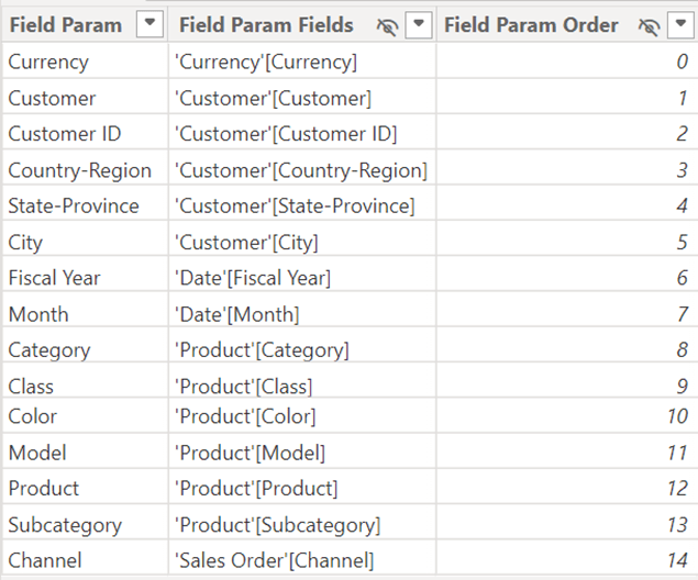
    Assuming you already have a field parameter table, you can add a new column that will add emojis to each row. For my example, I am using the Adventure Works semantic model and I have a Field Parameter table like below:

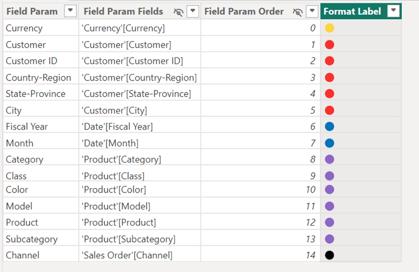
    Now, I want to have a color for each ‘grouping’ of dimensions (i.e. Currency, Customer, Date, Product, and Sales Order). To do this, I create a new column using the following DAX:

    Format Label =

    SWITCH(

        TRUE(),

        ‘Field Param'[Field Param] IN {“Currency”}, “🟡”,

        ‘Field Param'[Field Param] IN {“Customer”, “Customer ID”, “Country-Region”, “State-Province”, “City”}, “🔴”,

        ‘Field Param'[Field Param] IN {“Fiscal Year”, “Month”}, “🔵”,

        ‘Field Param'[Field Param] IN {“Category”, “Class”, “Color”, “Model”, “Product”, “Subcategory”}, “🟣”,

        ‘Field Param'[Field Param] IN {“Channel”}, “⚫”,

        “🟢”

    )

    Once this is complete, my field parameter table looks like this:

    The next step is to create a column that concatenates the Format Label field with the Field Param field:

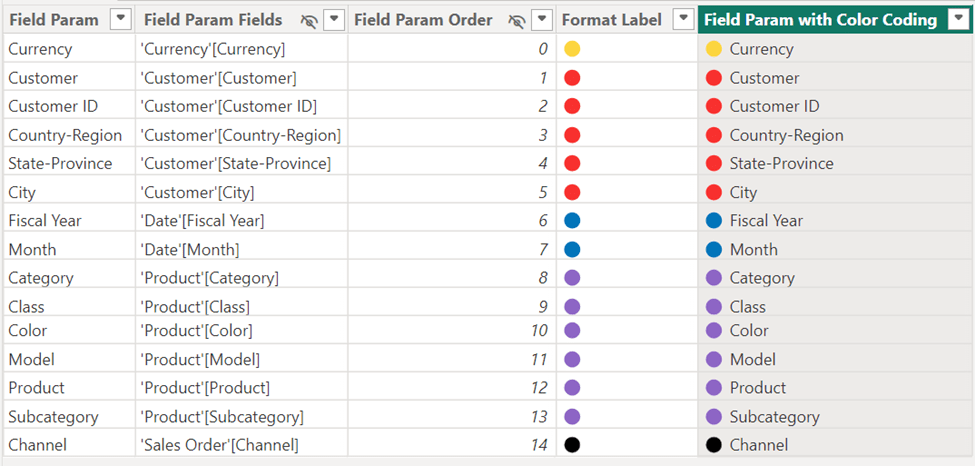
    Field Param with Color Coding = ‘Field Param'[Format Label] & ” ” & ‘Field Param'[Field Param]

    Once this is complete, our field parameter table looks like this:

    Traditionally, when you added a slicer to the canvas for the field parameters, you would have added the field of [Field Param] to the slicer, but for our purposes, we want to use the new column we created that concatenates the label and the name [Field Param with Color Coding]. If you want to make sure the new column is sorted in the same order as the ordering column, select the Field Param with Color Coding column and do a Sort by column of Field Param Order. Here is how your slicer will now look:

    Viola! Your users can now quickly identify which dimensions are part of the same grouping of dimensions! For a full list of emojis you can go to this site and copy whichever emoji you want from the Browser column and paste it into your DAX: Full Emoji List, v16.0 (unicode.org).

    As always – thank you for Power BI’ing with me!!

1 2 3 4
Next Page→

Blog at WordPress.com.


Loading Comments...
 

    • Subscribe Subscribed
      • Power BI with Me
      • Already have a WordPress.com account? Log in now.
      • Power BI with Me
      • Subscribe Subscribed
      • Sign up
      • Log in
      • Report this content
      • View site in Reader
      • Manage subscriptions
      • Collapse this bar